
C A S E S T U D Y
Son of a Vicar

Founded in 2024 by Matthew McVicar, Son of a Vicar is a New Zealand fragrance company based in Christchurch. His three flagship fragrances – Valour, Reverie, and Anecdote – were released in June, after engaging Blueprint to assist with designing and developing the packaging.
Matthew started Son of a Vicar with a desire to offer something different in the fragrance space, avoiding trends to focus on creating high-quality, story-driven perfumes that reflect individuality, confidence, and modern identity.
The scents are designed and blended in New Zealand, with a focus on refined ingredients, considered composition, and distinctive character. Each bottle represents a different facet of identity, with names and symbols that reflect the kind of presence each scent is made to carry.
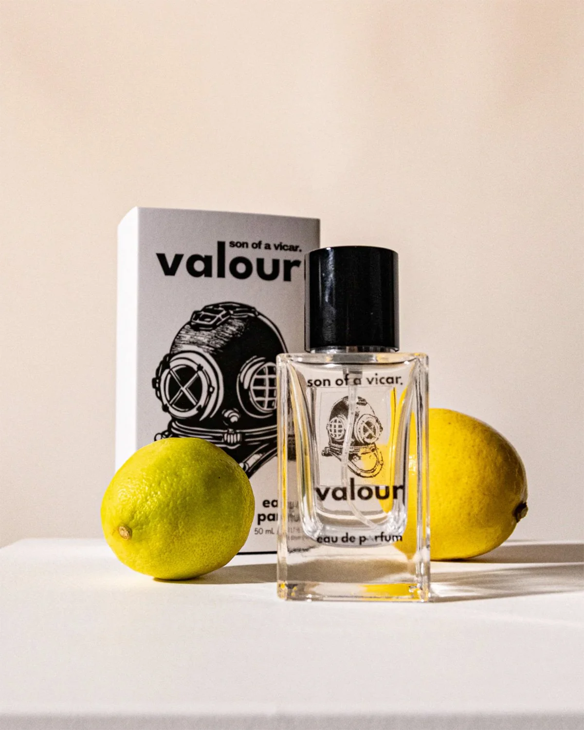

Valour is fresh, bold, and masculine, with the scent’s cool oceanic hints and the theme of courage in the face of danger represented by a dive helmet. Valour’s top notes are bergamot and citrus, with a heart of juniper berry and base of vetiver, sweet woods, and musk.
Warm, spiced, unisex fragrance Anecdote is “crafted like a story worth telling” – peach, suede, and chestnut meeting rich leather and musk. A quill symbolises the writing of one’s own story. The top notes are peach and citrus zest, with a heart of roasted chestnut and base of suede, musk, and warm woods.
For the dreamer, Reverie is floral-gourmand and feminine, the embodiment of a whimsical, dream-like state where anything is possible, with an open book representing creativity and imagination. Mandarin and pear form its top notes, with a heart of vanilla orchid and roasted cocoa, and a base of tonka bean, cashmere woods, and white musk.
The antique print style symbols representing the concept of each fragrance were hand drawn by Matthew himself, who then worked with our designer for the layout and typesetting, complementing the detailed graphics with clean sans serif typefaces.
When it came to the packaging, as is often the case, identifying the practical constraints and approaching them with design thinking and creative problem-solving led to an elegant solution with manageable production costs.
The outer packaging had to have both shelf appeal and ease of shipping, and protect the inner packaging – a stylish clear glass bottle with a square base and neat magnetised closure – from damage due to impacts or shifting within the box.
Working through the process with Matthew, we came up with the idea of an unprinted internal box that can be used for all of the bottles, with a sleeve closure that can be digitally printed in smaller quantities for each variant – giving Matthew flexibility with numbers, and a cost-effective solution that doesn’t compromise on quality.
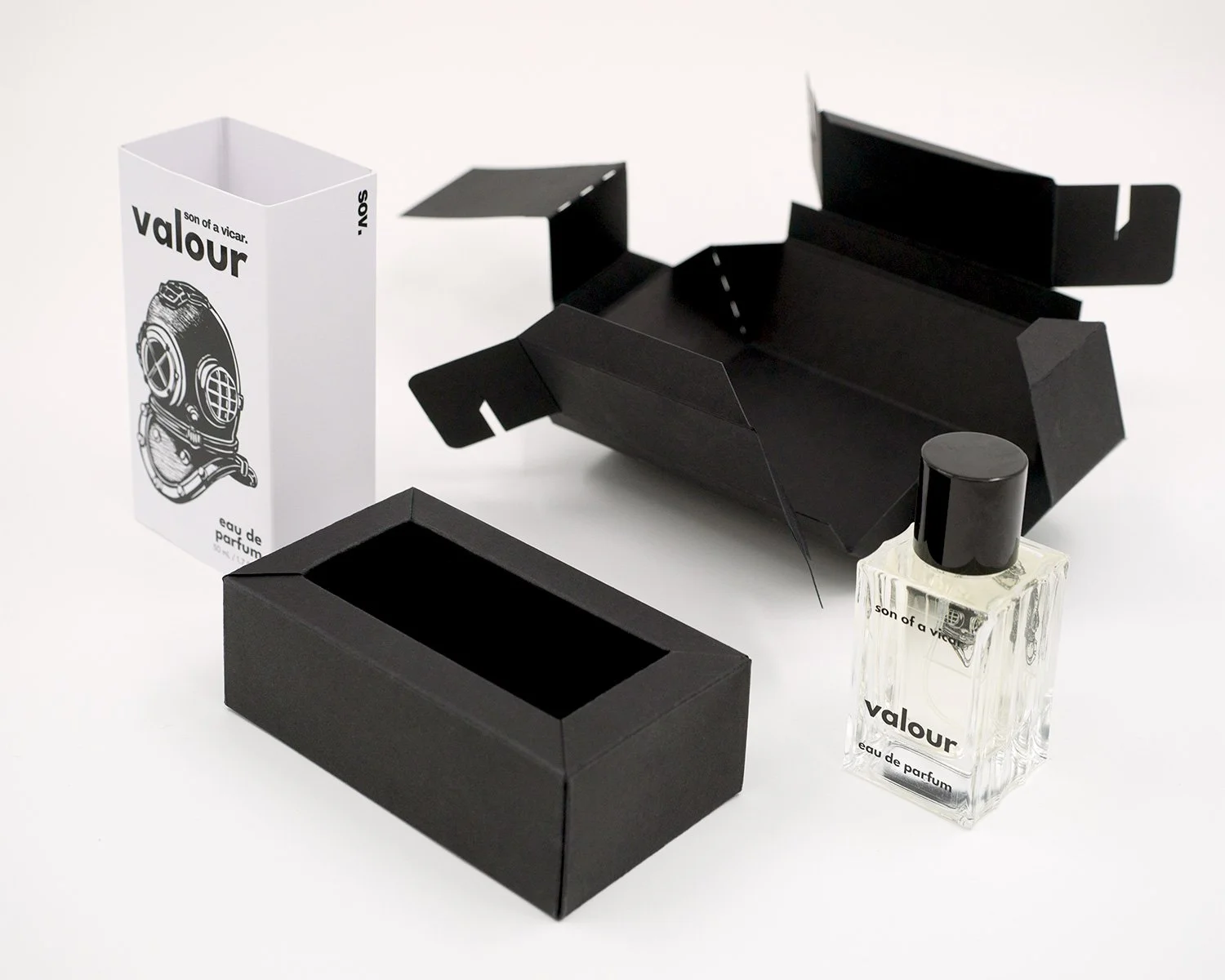


The internal tray is constructed from a single sheet of 435UM Burano Black, unprinted, die cut, and scored to fold and hold firmly together in its three dimensional form with no glue. The final form has insulating cavities within double walls around a recess into which the bottle fits precisely, supported and protected from movement or impact.
The sleeves are printed in black on 305gsm Glamcote White and matt laminated, with a spot UV overgloss subtly accentuating the name of each fragrance.
This deceptively simple print approach paired with understated graphic design gives an overall effect of easy sophistication and meticulous attention to detail.
In developing his first collection, Matthew has carefully considered, consulted upon, and resolved every aspect of the design into a product that quietly positions itself as a solid luxury brand – a process in which Blueprint is proud to have participated.
